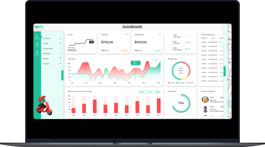
Dashboard Design UX/UI
EATY
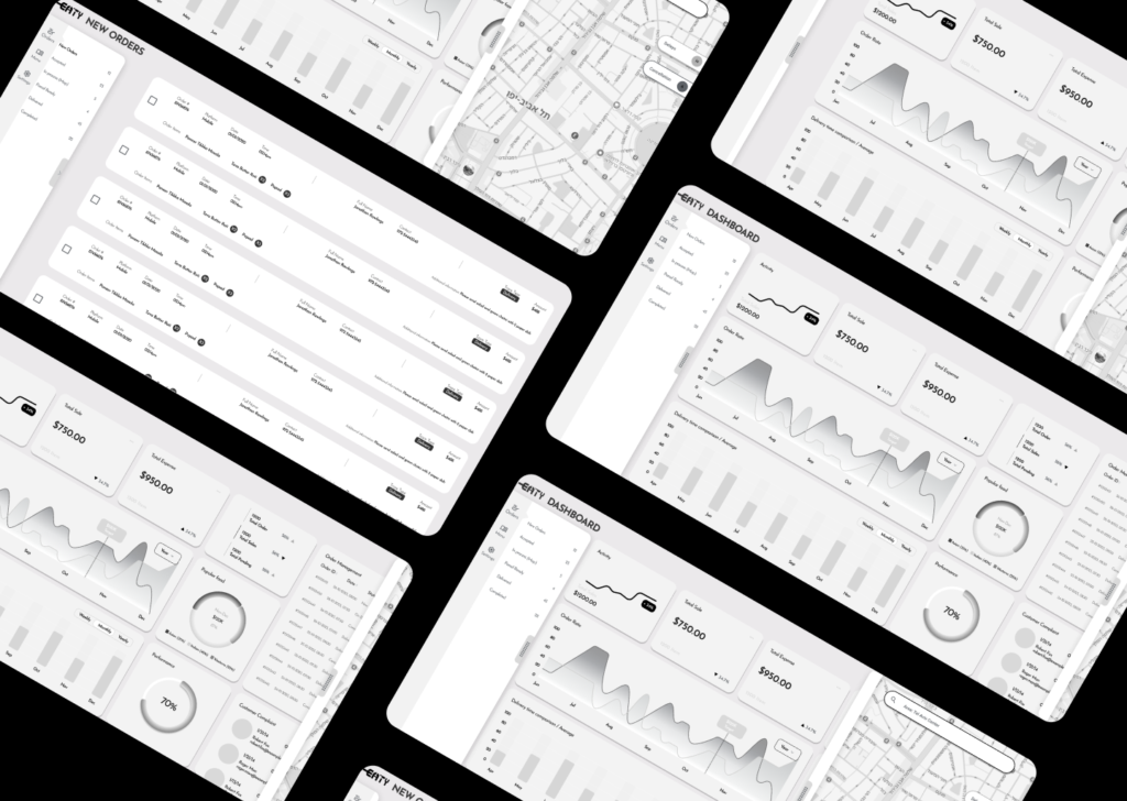
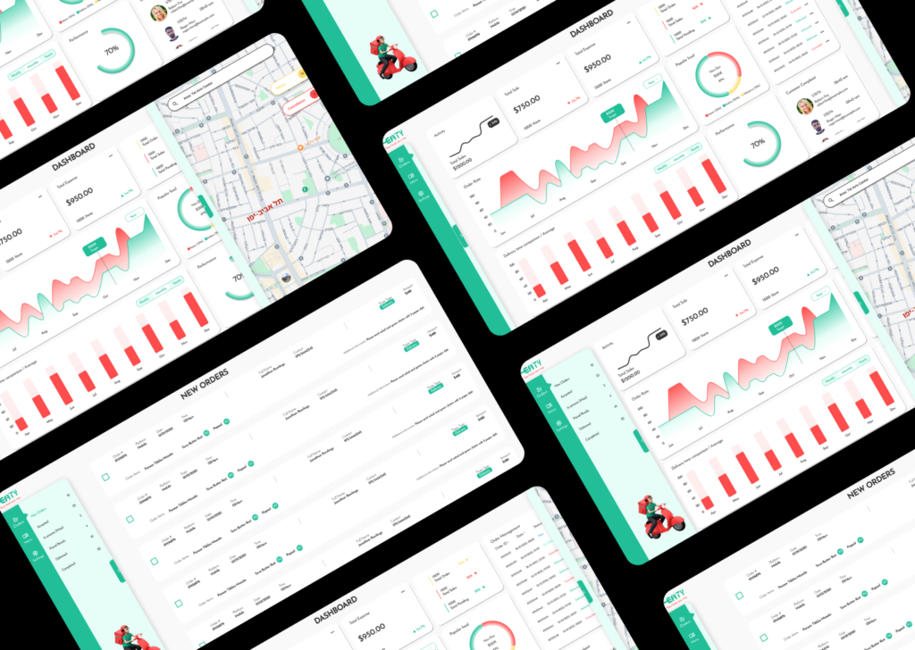
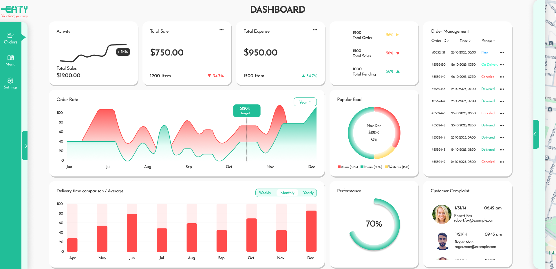
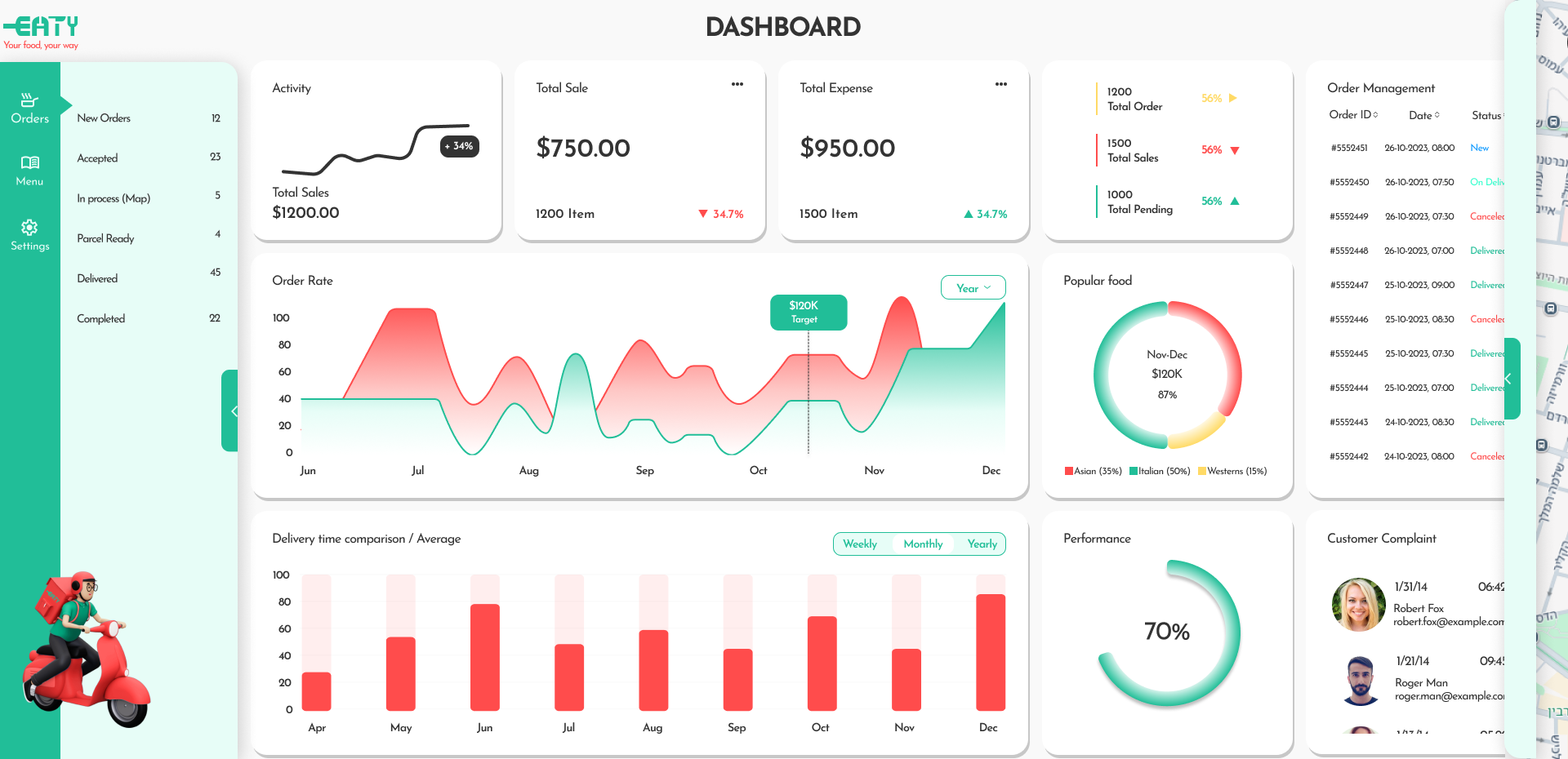
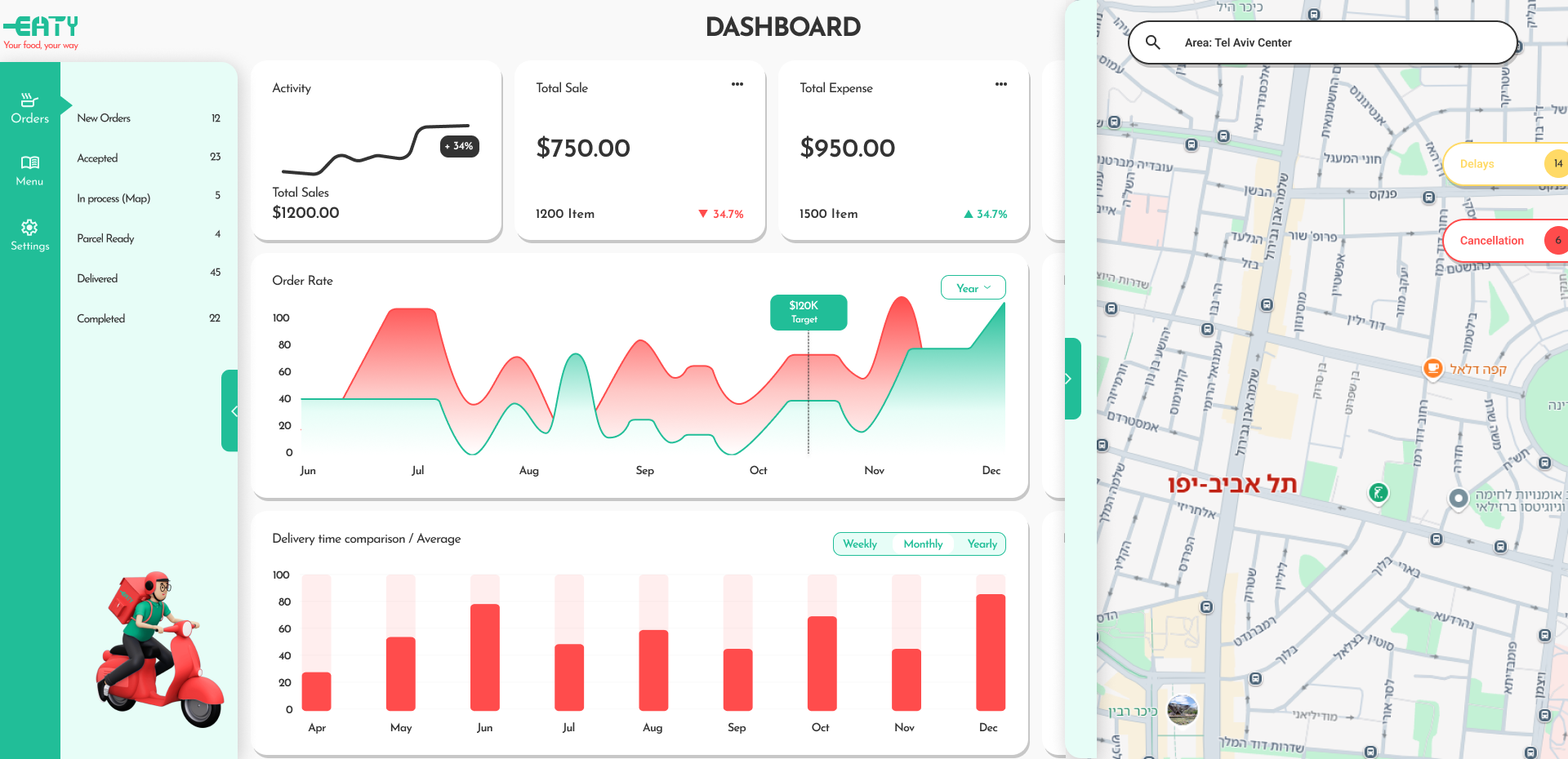
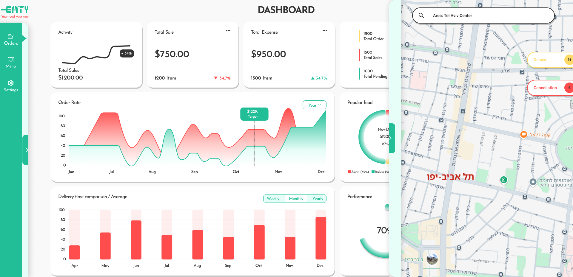
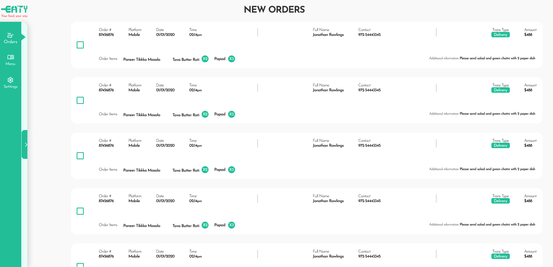
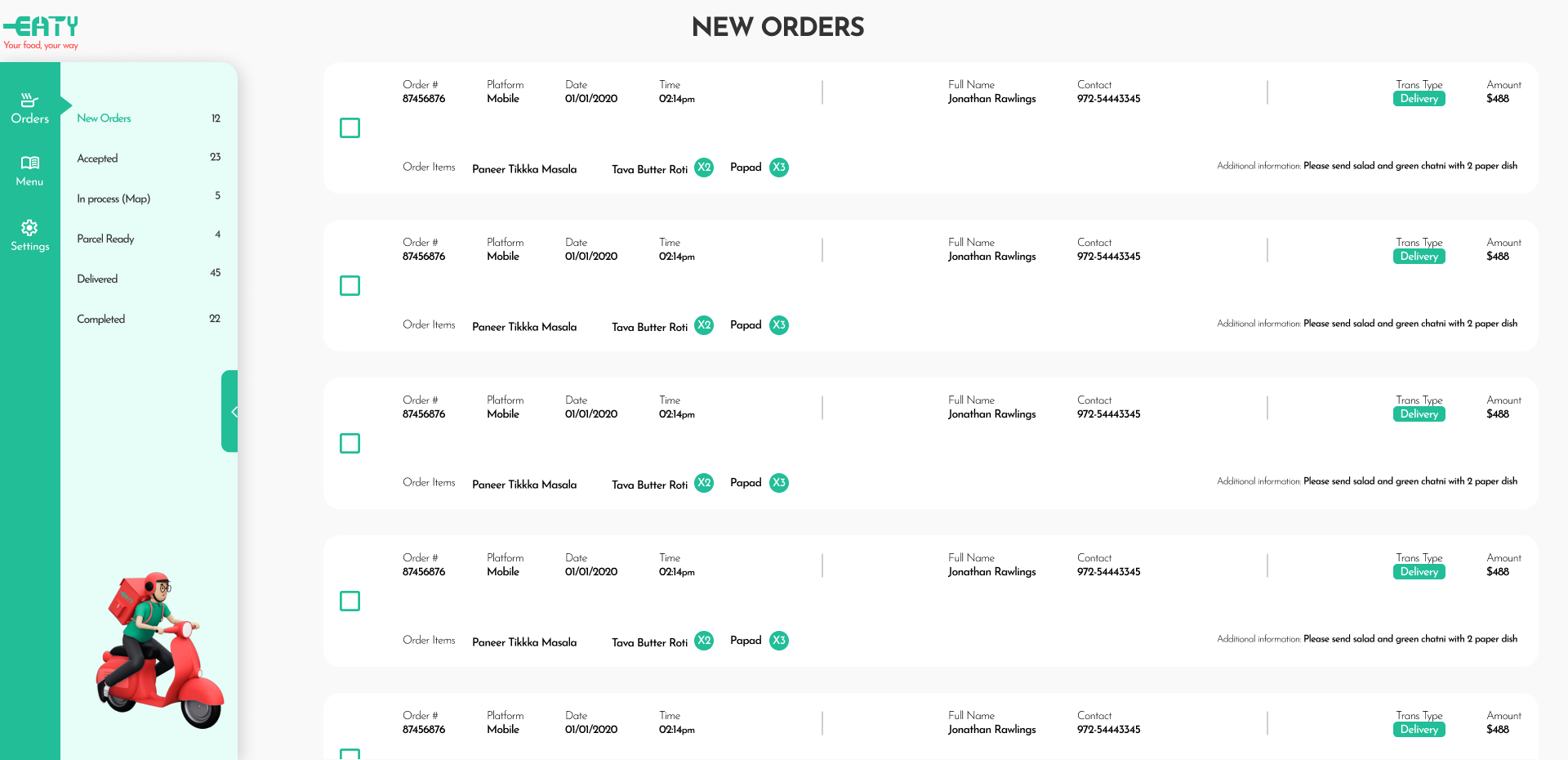
The project focused on creating an intuitive and effective user experience (UX) and user interface (UI) for the ‘EATY’ food delivery company’s dashboard.
By using visual elements like interactive graphs and tables, we made it easy for users to understand the data and make informed decisions.
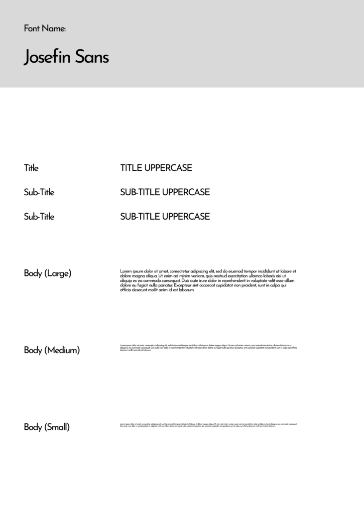
The design process relied on Figma, where I created a component and used plugins to ensure a consistent and efficient design.
The ‘EATY’ logo is a simple yet effective design, incorporates knife and fork imagery, symbolizing the company’s focus on food, it was designed in Illustrator and adapted to the dashboard interface.
Click the image to view the prototype


*Exercises given by “John Bryce” institution

